Domain
 Enamour.nu was registered in 2020 and founded since December 2015.
This domain is maintained by Aelyn and Cerine; we are also
both in charge of fanlisting designs, coding and maintainance. Currently, we house mainly anime and video game subjects,
as well as other various categories approved by The Fanlistings and
The Anime Fanlistings. This fanlisting hub is also part of the
Celestial Oracle Studio.
Enamour.nu was registered in 2020 and founded since December 2015.
This domain is maintained by Aelyn and Cerine; we are also
both in charge of fanlisting designs, coding and maintainance. Currently, we house mainly anime and video game subjects,
as well as other various categories approved by The Fanlistings and
The Anime Fanlistings. This fanlisting hub is also part of the
Celestial Oracle Studio.The main purpose of this collective is to showcase our fanlisting subjects we love, but it's deeper purpose is that it serves as our creative outlet. Our work ethic is about quality over quantity because each subjects are uniquely designed as we take pride of our work.
Name: the origins
beginnings of the domain name
Enamour has gone through major phases over the years; it was a precursor to Sky Tempest and Skylude. As both domains made it's unification, we decided to drop anything that symbolizes "heavenly or sky" and brainstormed a better domain name to suit a more significant meaning. Alas, the term enamor came to mind which is the standard spelling in American English, while enamour is standard everywhere else—both have the same meaning. Enamour with the letter "u" had a more aesthetic part to the word, whereas the term enamor without it felt lacklustre. Ultimately, the name was chosen simply due to the variety of subjects we love. It wasn't finding a domain name that was complicated, but rather the availability of the name. Fortunately, the extension .nu was still available to us. Thus, Enamour.nu was born.- en- (prefix) - in
- -amour (suffix) - love
- definition - be filled with a feeling of love for; to inspire with love
Design: the creation
behind the latest theme
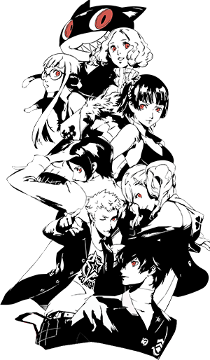
Currently Version 2 features the main protagonists called the
Phantom Thieves of Hearts from the series Persona 5: The Royal. This layout was tweeked for resolutions 1600x900 or higher on browsers Chrome, Firefox and Edge.
In contrast to the previous theme, this layout adapted P5's UI design which uses color boldly along with a combination of highly saturated red, black and white. These high
contrasts grab the user's attention and resonates with the theme of the game: "rebellion against social injustice".
Asides from red, the game also has a lot of grey scale colors; this is mostly done to give the game a distinct style in conjunction with of the heavy use of red. To create the navigation, we replicated the menu based from the game's UI menu items—the typefaces are still readable precisely because of the high contrast the words have with their background along with the thick stroke. Overall, we enjoyed creating the visuals of this layout because actual game's design integrate the theme so well into the layout itself. Provided below are links to our resources. You can also view more credits via Memento.
Asides from red, the game also has a lot of grey scale colors; this is mostly done to give the game a distinct style in conjunction with of the heavy use of red. To create the navigation, we replicated the menu based from the game's UI menu items—the typefaces are still readable precisely because of the high contrast the words have with their background along with the thick stroke. Overall, we enjoyed creating the visuals of this layout because actual game's design integrate the theme so well into the layout itself. Provided below are links to our resources. You can also view more credits via Memento.

- Photoshop CC - Image editing program
- Visual Studio - Coding program
- Google Fonts - Noto Serif and Open Sans Font
- Robotess - Fanlisting Script
- DafontFree - Rodfellows Wacky Font
- DaFont - Cupcakes Font
- BE Fonts - Expose Font
- qrayg - qTip Tooltip
